


Colour Psychology Vol 2: How Do Artists Explore Colour Psychology Within Their Art Practice?
- Rebecca Lethbridge

- Aug 13, 2025
- 6 min read
Updated: Aug 30, 2025
As previously mentioned in volume 1 of this mini-series, colour psychology refers to the concept that different colours can create different psychological and physiological reactions in people, affecting their thoughts, decisions, and emotions[i]. Many artists have explored colour psychology within their art practice.
Indeed, in my own practice I am particularly interested in relationships between architecture, colour and effect; considering the impact colour can have on emotional states and wellbeing, and delving into how colours attached to certain memories, emotions, or experiences can enhance the personal significance of buildings. By exploring the emotional capacity of a building through personal experience and colour psychology, I invite viewers to form attachments and bring personal connections to life through the interplay of architecture and colour. While creating each work I think about the emotions the viewer might get when they look at my work based on the colour pallete I have selected. This theme is important to me as it allows me to also delve into how colours attached to certain memories, emotions, or personal experiences can enhance the personal significance of buildings, by creating art that juxtapose my emotional connection to specific buildings through the use of different colour schemes, allowing the viewer to sense my attachment through the interplay of architecture and colour.
A number of more famous or well-known artists have used colour psychology in their work, and perhaps one of the most famous was Pablo Ruiz, more commonly known as Pablo Picasso. Pablo’s father taught him ‘the basics of painting’ and when Picasso turned 18 he went to France to start his art career focusing on a realism style. Picasso’s Blue period, Rose period, African period, Cubist period and World War II were all influenced by his surroundings and events happening at the time. Picasso said that “Colours, like features, follow the changes of the emotions”, demonstrating how his choice of colours reflects his good and bad mood.
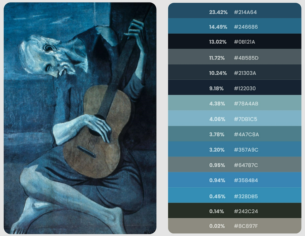
Picasso is known for his ‘blue period’ (1901-1904) in which he primarily created his art using cool blue tones which conveyed his mood and the depression that was happening at the time. During this period, he suffered from depression and the loss of his friend, and he said, “I was thinking about Casagemas that got me started painting in blue”. His paintings, for example ‘The Old Guitarist’ (1903) and ‘The Blind Man's Meal’ (1903), using blue and other dark colours often represented the needy and desperate people who were in poverty and pain. This period is said to have been influenced by the Spanish.

However, Picasso is also known for his ‘rose period’ when it can be said that his life started to improve and his mood started to improve due to him falling in love and managing to have a studio. This was first evident in Picasso’s paintings ‘Garcon a la Pipe' (1905) and ‘Acrobate et jeune Arlequin’ (1905) in which he drifted away from using cool blue tones and instead replaced them with more red, pink and orange tones representing his feeling of love and the experiences at the time[ii]. His subject matter also started to change and become more ‘positive’ as he started to paint clowns and carnival musicians. This period is said to have been influenced by the French.

Other artists who explored colour psychology include Henri Matisse who was a famous artist from the 20th century who was inspired by Fauvism. Matisse often chose to paint with bold and non-representational hues that represented emotion and meaning. This approach is deemed ‘revolutionary’ due to the fact that instead of focusing on traditional colour uses he instead focused on exploring how colour provokes different feelings and changes the meaning of the piece itself. Nethertheless, Matisse’s use of ‘prioritising emotional expression over realistic representation’ later went on to inspire later modern art movements, for example Abstract Expressionism. When looking at his work you can often see how he changed the ‘typical’, more naturalistic, colour of objects for more unrealistic colours that create an emotional response, therefore letting viewers emotionally connect to the art instead of viewing an image of reality. His work often challenged what was seen as ‘traditional notions of representation’, allowing other artists to use abstraction and emotional expression in their art, developing what is considered to be modern art[iii]. In addition to this, his work often contained ‘vivid contrasts and dynamic compositions’. Matisse’s work often displayed bold and vibrant shades of red to create a sense of ‘emotional intensity’. This is visible in his work ‘The Red Studio’ (1911) and 'The Dessert: Harmony in Red' (1908) where the red in the work creates feelings of energy and immersion.


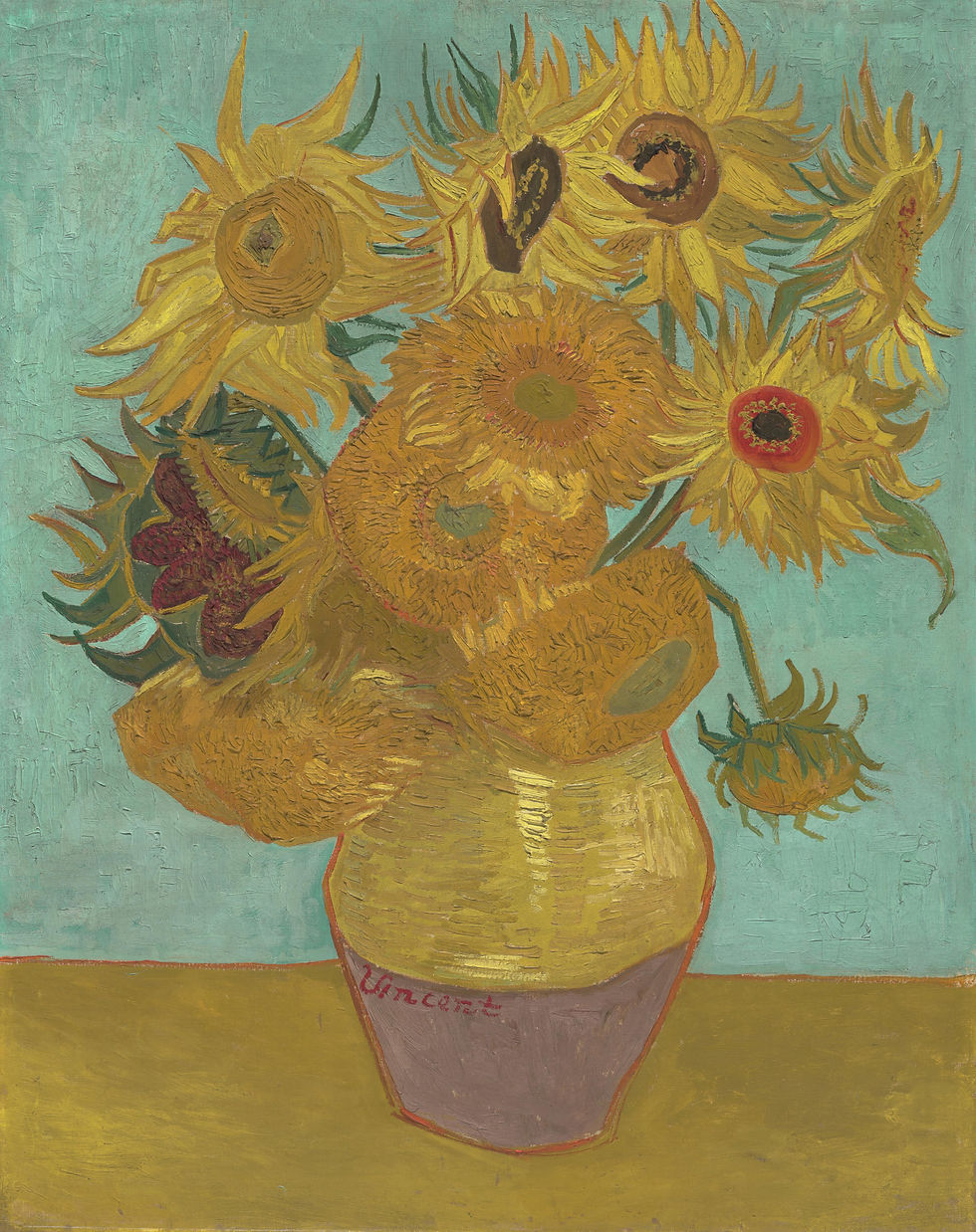
Furthermore, the yellow in Vincent van Gogh’s famous sunflower paintings is said to represent his knowledge of the emotional impact the colour yellow can have. This artwork only used shades of yellow demonstrating how it is possible to create art with a variety of shades of a single colour. For Gogh the sunflowers in this piece represent gratitude[iv] and also happiness as sunflowers represent loyalty, devotion and the cycle of life in Dutch literature. Moreover, he often experimented with colour placement and used colour to show emotion[v]. Gogh’s knowledge about the relationship between colour and emotions can also be seen through this quote he wrote to Theo (brother) “There is no blue without yellow and without orange”.
In addition to this, Claude Monet is well known for his paintings of waterlilies which incorporate a variety of shades of green, and it has been said that his garden was ‘his colour laboratory’, which became a space where he could investigate ‘the emotional qualities of green in changing light’. Similarly contemporary ecological artist Maya Lin also uses a lot of green in her work with the hope that is produces psychological associations to emphasise the importance of sustainability and renewal[vi].

Russian painter Wassily Kandinsky was born in 1866 and was also an art theorist who was interested in colour symbolism. Kandinsky is known as a pioneer of abstraction in western art[vii]. Like me Kandinsky often distorted the colours in his work, by swapping the naturalistic colours with colours you wouldn’t expect to see. This is evident in his work ‘Der Blaue Berg (The Blue Mountain)’ (1908-09) where he painted the mountain blue along with yellow and red trees. His use of bold colours depict a sense of hope that he hoped the viewer would feel rather than despair, whilst for Kandinsky the bold colours along with the black outlines represented his love of Russian folk art. Throughout his later work he created art that focused on choosing colours to express emotion rather than appearance[viii].

It can be seen that colour psychology is a powerful tool for conveying emotions and feelings through art, and that different artists perceive different connections between colour and emotions. This article also demonstrates how artists typically use multiple colours and consider colour relationships/colour theory and colour interactions to build emotional connections with colours. While colour psychology may not have been well known in some of these artists’ times it is clear that many artists consider the impact of the colours they choose whether that be consciously or subconsciously.
Sources and Bibliography
[i] Cianci, Lisa. “Colour Psychology and Physiology.” Pressbooks, February 23, 2023. https://rmit.pressbooks.pub/colourtheory1/chapter/colour-psychology-physiology/#:~:text=He%20is%20quoted%20as%20saying,with%20all%20of%20Freud's%20theories.
[ii] Nazanin, and Nazanin. “Pablo Picasso and the Clever Use of Colors! | Inside Colors.” Inside Colors | Step Inside Colors World, February 2, 2022. https://colors.dopely.top/inside-colors/pablo-picasso-and-the-clever-use-of-colors/.
[iii] Fiveable. “Henri Matisse on Color - (Art History II – Renaissance to Modern Era) - Vocab, Definition, Explanations | Fiveable,” n.d. https://library.fiveable.me/key-terms/art-renaissance-to-modern-times/henri-matisse-on-color.
[iv] Van Gogh Museum. “Vincent Van Gogh - Sunflowers,” n.d. https://www.vangoghmuseum.nl/en/collection/s0031v1962.
[v] The National Gallery, London. “Van Gogh’s ‘Sunflowers’ - Symbols of Happiness | Learn About Art | National Gallery, London,” n.d. https://www.nationalgallery.org.uk/paintings/learn-about-art/paintings-in-depth/sunflowers-symbols-of-happiness?viewPage=2.
[vi] Artpiq. “Color Theory in Art: How Different Artists Use Color Psychology to Evoke Emotions,” n.d. https://artpiq.net/blogs/news/color-theory-in-art-how-different-artists-use-color-psychology-to-evoke-emotions.
[vii] Tate. “Wassily Kandinsky 1866–1944 | Tate,” n.d. https://www.tate.org.uk/art/artists/wassily-kandinsky-1382#:~:text=Wassily%20Wassilyevich%20Kandinsky%20(16%20December,of%20abstraction%20in%20western%20art.
[viii] The Art Story. “Wassily Kandinsky Paintings, Bio, Ideas,” n.d. https://www.theartstory.org/artist/kandinsky-wassily/.


Brilliant article.